From the vibrant red of a stop sign to the calming blue of the ocean, colour plays a powerful role in our daily lives. But did you know that the psychology of colour also extends to Custom printed badges?
In this blog post, we'll explore the fascinating world of colour psychology in custom badge printing and how choosing the right colours can make a big difference in the impact of your badges.
The Power of Printed Badges
Printed badges are more than just pieces of paper with names and titles. They are a representation of your brand, organisation, or event.
Whether you're using badges at a corporate conference, a charity fundraiser, or a trade show, they serve as a visual introduction to the wearer. That's why it's crucial to consider the psychology of colour when designing your badges.
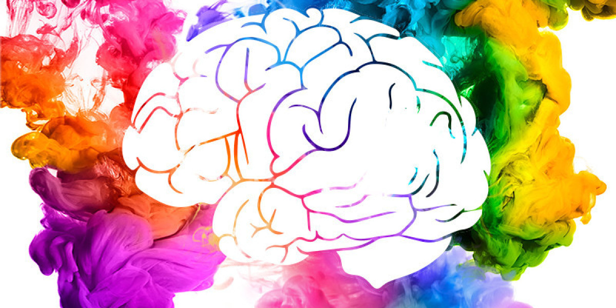
The Basics of Colour Psychology
Before we dive into specific colours, let's understand some basic principles of colour psychology:
- Warm vs. Cool: Colours can be broadly categorised into warm and cool tones. Warm colours like red, orange, and yellow tend to evoke feelings of energy, warmth, and excitement. Cool colours like blue, green, and purple, on the other hand, are associated with calmness, trustworthiness, and professionalism.
- Emotional Associations: Each colour can trigger specific emotions or perceptions. For example, red often represents passion, love, and urgency, while green is associated with growth, health, and nature.
- Cultural Variations: Keep in mind that the psychological impact of colours can vary across cultures. What a colour symbolises in one culture may have a different meaning in another.
Choosing the Right Colours for Your Printed Badges
Now that we have a basic understanding of colour psychology, let's explore how to choose the right colours for your printed badges:
Brand Identity
Consider your brand's colours. If your organisation already has established brand colours, it's wise to incorporate them into your badges. Consistency in colour helps reinforce brand identity and recognition.
Event Type
Think about the nature of your event. Is it a formal corporate gathering, a fun and casual festival, or a charitable fundraiser? The event's tone can guide your colour choices. For a formal event, consider cooler, subdued colours like navy blue or deep green. For a lively festival, brighter, warmer colours like red and orange can be more appropriate.

Target Audience
Who will be wearing your badges? Understanding your audience is essential. If you're catering to a tech-savvy crowd, modern and vibrant colours might resonate well. For a more conservative audience, traditional and subdued colours might be preferred.
Colour Combinations
Don't be afraid to mix and match colours. Complementary colour schemes, where colours opposite each other on the colour wheel are used, can create eye-catching badges. Analogous colour schemes, using colours adjacent to each other on the wheel, can provide a harmonious and balanced look.
Contrast and Readability
Ensure that the text on your badges is easily readable against the background colour. High contrast between text and background improves legibility, which is essential for effective badges.
Conclusion
In the world of printed badges, colour is more than just a design choice—it's a powerful tool for conveying emotions and messages. By understanding the psychology of colour and carefully selecting the right hues for your badges, you can make a lasting impression on your audience.
Remember, it's not just about what's written on the badge; it's also about the colours that surround it. So, the next time you're designing printed badges, consider the psychology of colour and watch as your badges leave a lasting impact.
Source: https://www.pr3-articles.com/Articles-of-2020/psychology-colour-custom-badge-printing-0